
What changes, and why
We checked chefmbj.com as it is live today. Here is what holds it back, worst first, and what the new home page does instead.
A stock photo sits in his own gallery
The "At a glance" gallery loads a GoDaddy stock image: gloved hands plating canapés. It sits between his own dishes, so a visitor reads it as his work. One spotted stock photo makes people doubt the rest.
The browser tab shows a broken "&"
The page title is encoded twice in the code. So the tab and the Google result read "Culinary Innovator & Hospitality Advisor", with the code showing.
On a phone, the first screen never says who he is
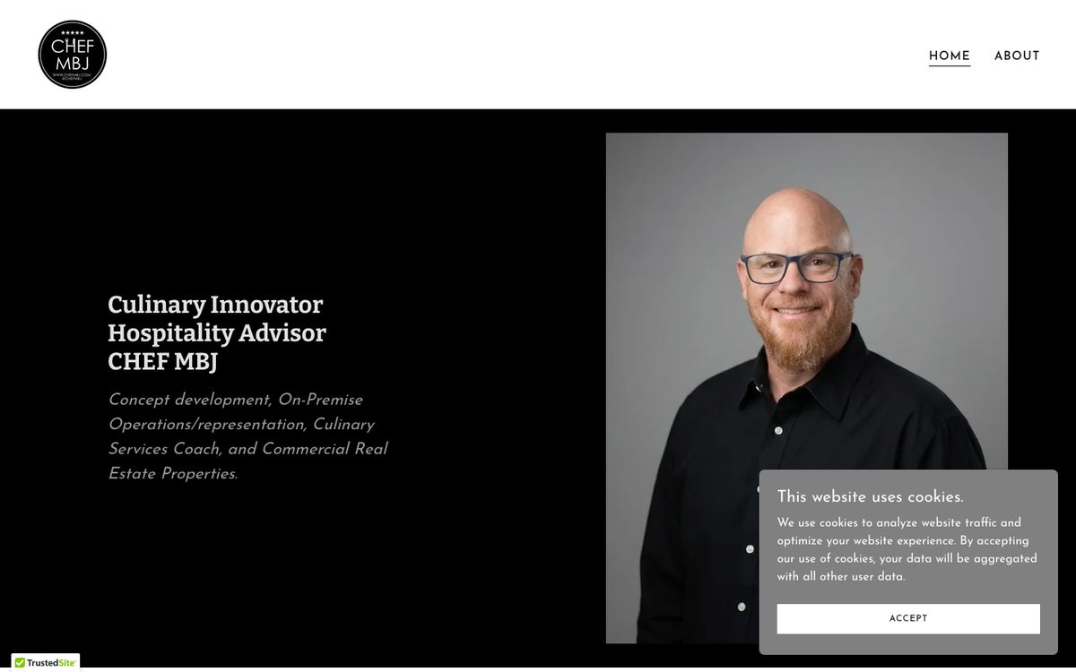
At phone width the headshot fills the top and the cookie banner covers the rest. His name and what he does only show after you scroll.
A cookie banner and a badge cover the first screen
A grey cookie box sits over his photo and a TrustedSite badge sits in the corner. They are the first things you have to deal with.
No way to get in touch on the first screen
The top of the home page is a grey studio headshot and an italic grey line. There is no button. The email link only shows up near the bottom.
His services are hidden on the About page
Commercial Hospitality Real Estate, Experienced Business Advisor and Restaurant Design are listed under the bio on About. The home page never names them.
The gallery is tiny thumbnails with no captions
"At a glance" shows his food as 70 × 70 pixel squares. Nothing says what the dish is or where it was served.
Shared links look weak
When someone shares the site, the preview title is just "CHEF MBJ" and the card is the small kind, with a tiny image.
18 of 45 home images have no alt text
Screen readers and Google get nothing for those images.
A heavy page on GoDaddy Website Builder
The home page is 174 KB of HTML plus 45 images, built on GoDaddy Website Builder 8. It loads in pieces, with the cookie box on top.
What the new home page does
- His plate photo, full screen, as the first thing you see.
- One clear action, Send us an email, in the header and again at the end.
- The three services from the About page, set on Home.
- A map of the kitchens he has cooked in.
- Testimonials cut to their strongest line, with the full text one tap away.
- The gallery as large photos, with a lightbox.
- A real business footer with the map.
- It loads in one go, with no cookie wall.
This sample is the home page. The About page and the rest are built in the project.